Got a Tip?
tips @ chicagoist
About Chicagoist

Chicagoist is a website about Chicago. More

Editor: Marcus Gilmer
Publisher: Gothamist

About | Advertising | Archive | Contact | Mobile | RSS | Staff

Categories
Favorites
Contribute

Latest tip:

George Ryan should stay in jail. He knew what he was doing, and if it were one of us working peop [more]


Latest link:


Latest Photo:


Recent Comments
The Interview
Tshirts
Subscribe
Use an RSS reader to stay up to date with the latest news and posts from Chicagoist.

September 29, 2008

New Trib Layout: Your Thoughts?

newtribune092908.jpg
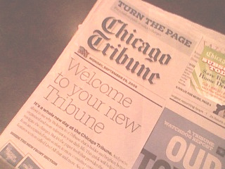
It could be a breath of fresh air into a stodgy, century old newspaper that's been accused of being stuck in the past. Or, it could be a rearranging of the deck chairs on the proverbial Titanic. Whether or not the redesign of the Chicago Tribune will provide a much-needed bump to circulation remains to be seen, but now that the new look has been released to the world, we can at least finally ruminate on whether or not it's a good look.

Our first thought: Thank the Deity Of Your Choice that it doesn't look like the idea that got floated a month ago - remember, it could have looked like this. Our second thought: Is this what is really needed? Will the bright colors and flashy graphics get more people to put their eyeballs on the actual copy? Will more papers start flying off newsstand shelves? This response from the "your questions answered" raised our eyebrows: What does your reader research tell you?

Our research tells us that readers want more local news, personally relevant and useful content, consumer information, watchdog coverage, more graphics, better navigation, and lots of charts, statistics and lists.

Fewer pages. Fewer sections. An unchanged website. A goofy new name for the Tempo and Obituary sections ("Live!" and "Legacies," respectively). An ever-shrinking newsroom. A newspaper run by radio people. Does this resemble the above answer? Aside from "more graphics," which stinks of a throwaway question on a bad marketing survey, we don't see any of the other "researched" suggestions in the new paper.

The real question, obviously, is content. Will the stories remain strong? Will columnists continue their employment? Will there be an expansion in solid local stories and investigative work that is the Sun-Times' stock and trade? Or will we get a bunch of fancypants charts and graphs, with stories yanked from the AP? All the bells and whistles in the world can't keep a paper going if the writing and reporting starts to slide.

At this point, the rumor from a few years ago about the Trib going to a tabloid-style paper couldn't hurt any more - might as well give that a shot too, guys. Is it the Red Eye yet? No. Is it more USA Today-ish? Yeah. Whether or not it actually looks good at this point isn't the argument. Is it going to be the lifesaving move that the paper is looking for? Not likely.

Email This Entry


Advertisement: Chicagoist Continues Below!

Comments (18) [rss]

Our research tells us that readers want more local news, personally relevant and useful content, consumer information, watchdog coverage, more graphics, better navigation, and lots of charts, statistics and lists.

Again and again, it's the local content, the unique POV that only a CHICAGO paper can have about CHICAGO that's going to make or break them

Charts and lists and graphic elements are fine, as long as they're backed-up by strong content. Not everyone reading the paper is a U of C grad or interested in a 5000 word story on rezoning. Strong graphical content can make the paper more accessible to weaker readers.


"A goofy new name for the Tempo and Obituary sections"

And "tempo" wasn't goofy? I never even had any idea what it meant. Is it even a word? What did that word have to do with any of the content in the section?


By the way, I'm also curious why you think the name "legacies" is goofy. The entire point of the obitiary section has always been to show the life legacies of those that have recently passed away. It seems like a perfectly logical name to me.


"And "tempo" wasn't goofy? I never even had any idea what it meant. Is it even a word?"

You're kidding, right?


I think it looks silly and small market. That being said, I'd bet that in a week or two, we won't even remember what the old paper looked like.

Also, "Tempo" has been the name of the features section of the Tribune dating back to at least the mid-1970s....losing the name is like losing an old friend. Oh well.


As a Tribune reader since the 70s (Gary Deeb anyone?), I always assumed "Tempo" was a reference to the pace of life. You know, keep the Tempo, keep moving, lifestyle things, etc. I never really gave it too much thought beyond that.

That being said, is the new Tempo section pronounced "Live!" with a short 'i' as in 'Live and Let Die,' or is it Live! with a long 'i' as in 'Happy Days is filmed before a live studio audience'?


It kind of reminds me of the UK's Guardian, which I like a lot. If this means the tribune will have a more liberal slant and, more importantly, start giving away free posters every issue - I'm for it!

I honestly was not as horrified as I thought I'd be, the top-of-the-fold headline story on neckbeards a few weeks ago was really the height of my disgust and perhaps my expectations have been forever lowered. But from a design standpoint - I like it.


I fondly remember the tempo section, too... and I guess I always took it to mean that it was sort of the "pulse" or the "beat" of what was going on.

It could have been much worse.


"That being said, is the new Tempo section pronounced "Live!" with a short 'i' as in 'Live and Let Die,' or is it Live! with a long 'i' as in 'Happy Days is filmed before a live studio audience'?"

Your choice of examples is pretty funny...


I think "Live!" must be screamed, as loudly as possible.

Pronounciation can vary, volume is critical.


Overall, it's much better than I expected. I have to say the new design suggests they should have also gone to a tabloid format.

I have been disappointed that there are more graphics and white space on Voice of the People page when I wish they would use that space to publish more letters.

It does feel like an entirely different paper, perhaps the most radical change since they merged in their evening tabloid, Chicago Today, in September 1974. Remember when it was "The 24 hour a day Chicago Tribune"?


I'm having a difficult time telling editorial apart from ads (which seem much larger).

Not as bad as I had feared, but not a positive change, either.

And they dropped Non Sequitur from the comics!! NO!!!


I scanned through the paper quickly. Couldn't believe what a piece of crap I was looking at and immediately canceled my subscription. If I want lightweight junk, I get plenty of that on the web. Now there is no where to turn for credible local news. What a shame. Well, back to the N.Y. Times.


They dropped the comic strip Non Sequitur.
That's criminal!


"Couldn't believe what a piece of crap I was looking at and immediately canceled my subscription. If I want lightweight junk, I get plenty of that on the web."

Do you have any specific examples? The only thing that really seemed to change was the design. The Tribune has had mostly lightweight articles with a lack of depth for quite awhile. It is nothing new.


Have they devoted 3/4 of their "new" paper to Obama?


OH BOY! BIG PHOTOS!


Seriously, anyone who doesn't know what "tempo" means should probably have been reading the Sun-Times to begin with.

The revisions generally seem to make the paper as dumbed down as possible, which is really disappointing - I've always been proud of having a local paper that could win a Pulitzer once in a while, even if I thought the writing often lacked nuance and depth. I firmly believe that one of the reasons people aren't "strong readers" is because they aren't exposed to strong writing that will force them to think in sentences more complex than "Bad man take money." We live in a complicated world, and sometimes the explanations for what's going on are equally complicated.

The combined National-World-Metro-Business section is now less than half what any 2 of those sections were before. I do applaud the new emphasis on consumers in the business section; anyone who wants serious business news already reads the Journal or the Financial Times, and there aren;t as many sources for consumer-focused financial information. I don't mind the addition of more graphics, because I know information is often more accessible when the visualization is strong. However, I hate that they seem to be replacing entire stories with graphics - witness today's box on similarities between the ways dinosaurs and birds breathe.

And yeah, they got rid of one of the smartest comic strips I've ever read and still kept Cathy & Broom Hilda.

 
Post a comment (Comment Policy)

2003-2008 Gothamist LLC. All rights reserved. Terms of Use & Privacy Policy. We use MovableType.

Site Meter