This Map Shows You Exactly Where Chicago's Commuters Are Going
By Gwendolyn Purdom in News on May 26, 2016 8:46PM
Your commute may very well be colorful—there’s the red face of the road raging driver in the next lane, the purple bruise you develop from getting doored on your bike, the yellow pit stains of the El rider squished against you. But the kind of colors you’ll see in data enthusiast Mark Evans’ new commute visualization map are far more pleasant. Even kind of dreamy.

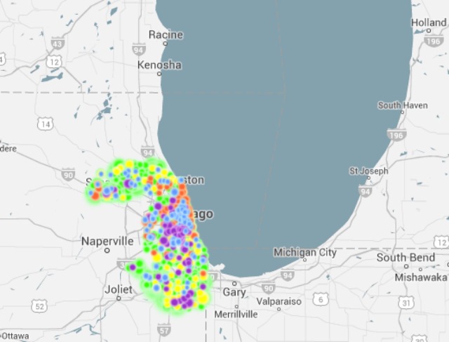
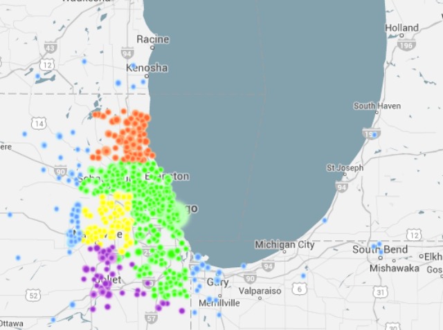
The Michigan-based blogger used a combination of U.S. Census information and Google Maps to plot out animated visualizations of commuters going to and from their home or workplace in counties across the country. Cook County’s illustration tracks an estimated 48,355 total commuters artfully bunching then scattering to and from various points in the Chicago area.
The colors in the Cook County visualization correspond to which counties are represented in the commuter sample, so, green is Cook, yellow is DuPage, orange is Lake, purple is Will and blue is Other, in this case. The size of the dots indicates the relative size of the number of commuters moving from the same Census tract to the same Census tract. The Cook County graphic includes 604 unique census tracts, traveling between 20 and 100 miles.
The results are unsurprising; commuters from as far east as South Bend, Indiana and as far north as Kenosha, Wisconsin, swoop into the Chicago area for work, while a thick concentration of city-dwellers tend to stay put during the work day.
The map is mildly mesmerizing. Evans notes in his post about the project that even his dog “seemed to go into a trance” watching his work. We don’t blame him. It’s nice to know there’s at least one way to look at your commute with a positive—and vibrant—spin.
To watch Evans’ animations of other counties, use the state and county drop-down menus here.
Here's what it looks like when commuters have made it into the city:
...And where they go when they leave:
[H/T: City Lab]