Today In Maps: Grocery Stores Vs. Bars
By Rob Christopher in Food on Mar 9, 2010 7:40PM

FloatingSheep loves to stick data on maps, thereby graphically illustrating the data, and one of their new maps is a real lulu. Using stats gleaned from Google Maps, they
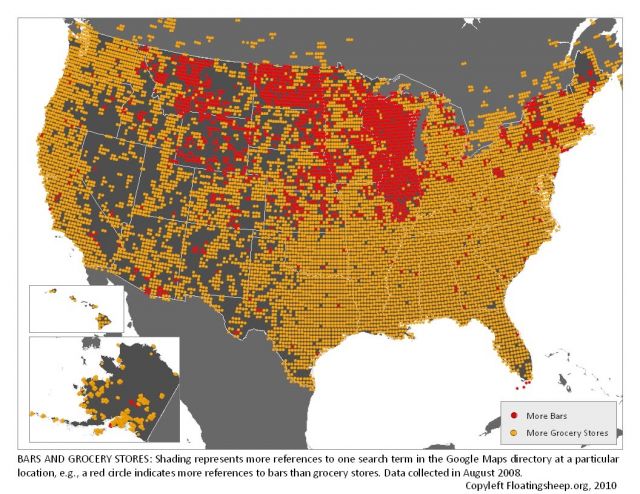
did a simple comparison between grocery stores and bars to discover a remarkable geographically [sic] phenomenon. We had expected that grocery stores would outnumber bars and for most parts of North America that is the case. But we could also clearly see the "beer belly of America" peeking out through the "t-shirt of data." Starting in Illinois, the beer belly expands up into Wisconsin and first spreads westward through Iowa/Minnesota and then engulfs Nebraska, and the Dakotas before petering out (like a pair of love handles) in Wyoming and Montana.In other words, on the map above every patch of red represents a location where bars outnumber grocery stores. Dubious at the results, they looked at official 2007 Census Country Business Pattern data. And it matched up.
It's easier to see on the full sized map: although Illinois clearly loves a good tipple, all that red in Wisconsin jibes with Forbes 2006 list of America's Drunkest Cities, which had Milwaukee as the most soused metropolis in the nation. Chicago? #6.