Mapping Chicago's Racial Divides
By Kim Bellware in News on Sep 20, 2010 5:00PM
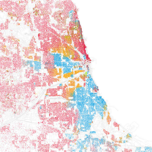
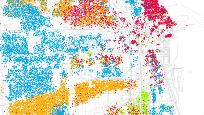
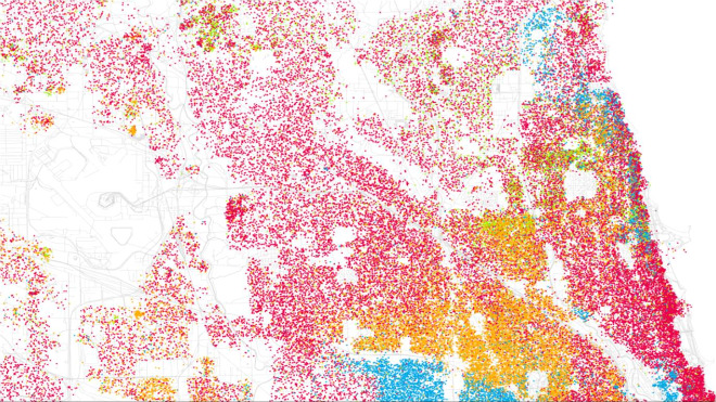
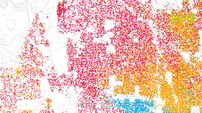
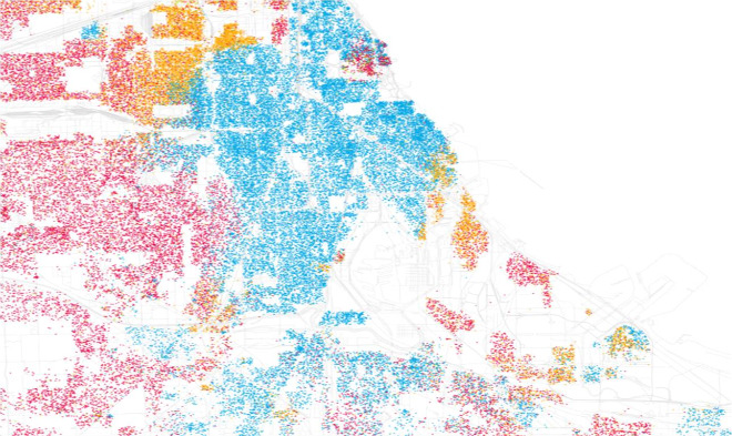
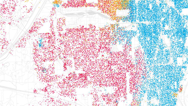
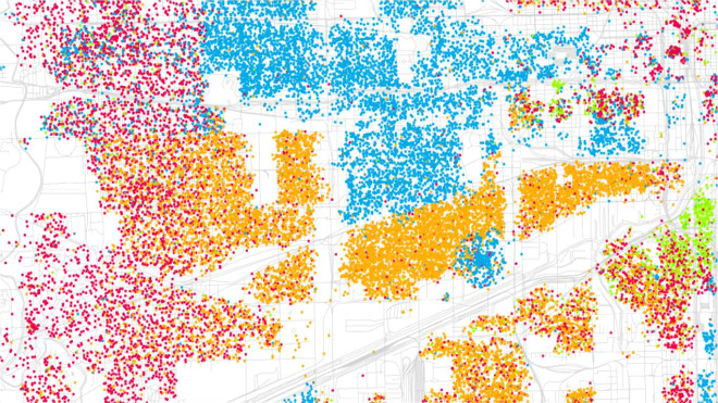
Inspired by Bill Rankin's map of Chicago that laid out the city's racial and ethnic dividing lines, photographer Eric Fischer wanted to see what other cities looked like when mapped the same way (Fischer previously geo-tagged the entire city). Last week, Fischer shared the findings via his Flickr page, also making his own map of Chicago. Both Rankin's and Fischer's maps use data from the 2000 Census, with Fischer matching his map to Rankin's key in which each dot represents 25 people: Red = White, Blue = Black, Green = Asian, Orange = Hispanic. Rankin's maps, created in 2009, also map out race and income.
