Notes from the Tech Department: Gothamist Network Redesign 2011
By Chuck Sudo in News on Feb 7, 2011 7:00PM
(Ed. Note: We know that the Disqus comment roll out and the decision to switch the RSS feeds to summary mode took some of you by surprise. So we wanted to keep you abreast of the next major change to how you'll be viewing the Ist-a-verse sites in the coming weeks. We'll turn the floor over to Jake Dobkin from here. Jake and Gothamist tech director Neil Epstein are also taking suggestions and answering questions in the comments to the original post at Gothamist. — CS)
Hello friends! We've decided to redesign Gothamist and our sister sites, and we need your help. If you are interested, please read on. The goals of this project:
1) Refresh the design: we last refreshed our design in 2009, and a lot has happened on the web since then. Specifically, we want to expand the width of the page (screens are getting bigger) and we want to use some new technologies to make the site more attractive and readable (for instance, Typekit for fonts.)
2) Simplify: We want to eliminate any extraneous elements that distract from the content (and ads!). A lot of sites seem to go for a "more is more" design aesthetic these days- we want to go the opposite way.
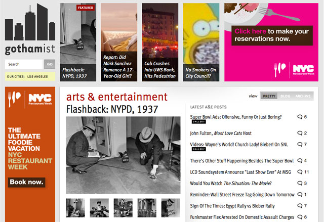
3) Highlight our sections: did you know Gothamist has three sections? We do! News, Food, and Entertainment. But because we now publish 50+ posts a day, and more than half of those are news, the other two sections get a little drowned out. So we want a new version of the front page that highlights the sections, so you can easily find our great food and entertainment posts.
4) Increase readability: have you ever noticed 50 posts a day is a lot to digest in the blog format? We'll always offer a bloggy ("reverse-chronological") view of the site, similar to what we have now—but we want a second option for the front page- something that makes it easier to see what stories are most important, and to scan the last 24 hours of headlines in each of our sections. And we want that to be the default for new users, so we don't scare them off with a fire-hose of fresh stories.
5) Enhance our ad options: especially the full-page takeovers. This is important, because it pays the bills! We want to be able to accommodate bigger ad units, tastefully deployed around the page.
We've prepared a beta-version of the new-design here. If you'd like to give us some constructive feedback, please use the comments on this post. You can switch back at any time using the link at the top of the page. Some elements, like the header, have multiple versions we're trying out- refresh the page a few times if you want to see all of them.
We're going to be testing and refining this design over the next 4 weeks, before launching it—so please participate if you can!
PS: We'll also be releasing new versions of the site for phones and tablets—this version is intended just for your regular computer.