Reader Redesign: A Talk With Chicago Reader Editor Mara Shalhoup
By Chuck Sudo in News on Apr 28, 2011 3:35PM

Image via Chicago Reader
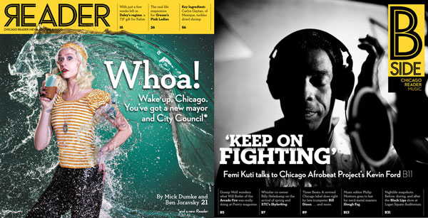
Trust us, a redesign can be a bit cathartic. The Chicago Reader launches an all new redesign of its print edition, with several events across the city to celebrate the relaunch. It's a marked facelift from the tabloid format in which it's lingered in recent years. The glossy covers and stapled pages suggests more of a magazine than a newspaper, which Creative Loafing chief sales officer Alison Draper told Tribune media columnist Phil Rosenthal is intended to make the Reader less disposable than in the days where folks would pick up copies of "The Old Gray Doorstop" and pocket the music section as a reference guide. In addition to the redesign, including two glossy covers, column names have been dropped in favor of the columnists names and the music section, long one of the Reader's strengths, has been expanded and re-branded. Now known as the "B-Side," Editor Mara Shalhoup told us that the expanded music coverage is one of many links between the paper's past, present and future.
Shalhoup is no stranger to redesigns and dealing with cutbacks and layoffs like the Reader has in recent years. She guided a redesign of Creative Loafing's Atlanta newspaper and, as Reader media columnist Michael Miner wrote when Shalhoup was named editor, "was as much a survivor as any of us, and she’d had a harder war." I had a chance talk with Shalhoup by phone about the Reader's redesign, the state of morale at the paper, and the future challenges the Reader will face with both its print and web concerns.
Chicagoist: I guess I start by asking how the transition from Atlanta to Chicago has been for you?
Mara Shalhoup: It's been good. There was a time during (Creative Loafing's) bankruptcy where things were shrinking so fast we wondered what was going to happen. But the folks who stuck around, both here an in Atlanta, had a sense of urgency to protect the legacies of the papers. The Reader was always admired from afar, and I'm honored and flattered to come here.
C: Creative Loafing is now owned by a hedge fund (Atalaya Capital Management) and hedge funds always have a eye toward profitability. What does their staying with the papers say about their investment?
MS: I think they just want the papers to do well. It was a wise decision for them to stay with the papers; it helps stabilize things. And they've been very smart business people about not gutting the papers further.
C: Is the return of Mick Dumke to the Reader a reflection of that new stability? Was that in the works before you came to Chicago?
MS: I don't know if it was in the works, but I reached out to Mick once I came aboard, we had lunch and had some common ground on how news should be covered for the paper. I assured him that he would have a good support system if he came back.
C: Tell me a bit about the redesign.
MS: The paper's now divided into two sections. You have an A-side, which will focus on politics, art and culture. You flip it over to the "B-Side," which is an expanded music section and, to a lesser extent, nightlife. It's like a dual publication, but we also wanted to recapture the strong connection readers had with the music section when the paper was in four sections.
C: Was this redesign in the works before you were named editor?
MS: It was in the works since November, December, I believe. We worked with a design consultant named Ron Reason. I went through the redesign process with Creative Loafing Atlanta and Ron was also a part of that, so I knew what he could do.
C: Has the staff had input into the redesign?
MS: It's been a collaborative effort. Everyone here wants to uphold the legacy of the paper. I can't express the gratitude I have for our art director, Paul Higgins, who's been instrumental throughout this process.
C: Is this redesign make the Reader look similar to other Creative Loafing properties?
MS: Not at all. The papers in the CL network all look markedly different. Atlanta has a Southern, laid back sensibility. DC's City Paper looks way different from both that and the Reader. They wanted them all to have their own look and feel.
C: With this new redesign, where does the hard investigative stories the Reader is known for fit in?
MS: We're still devoted to long-form narrative. But we realize there needs to be a balance between narrative and information. Not all stories require 5,000-8,000 words. An example: Mick and Ben (Joravsky's) City Council Guide in this week's paper isn't long-form narrative. But it shows the depth, knowledge and humor of the both of them
C: How will the reader be approaching synergies between its print and web concerns moving forward?
MS: The Reader will still focus on print, with a web component. The Web is constantly evolving and we want to create certain synergies. We want our critics to be at the center of the paper and in the mix during discussions.
C: Are there plans to redesign the website?
MS: There are, but they won't be as noticeable immediately. We've renamed the blog "The Bleader" and we hope to be making it more playful and personality driven.