How Would Wrigley Field's Proposed Signage Look Like With Advertising?
By Chuck Sudo in News on May 2, 2013 4:00PM
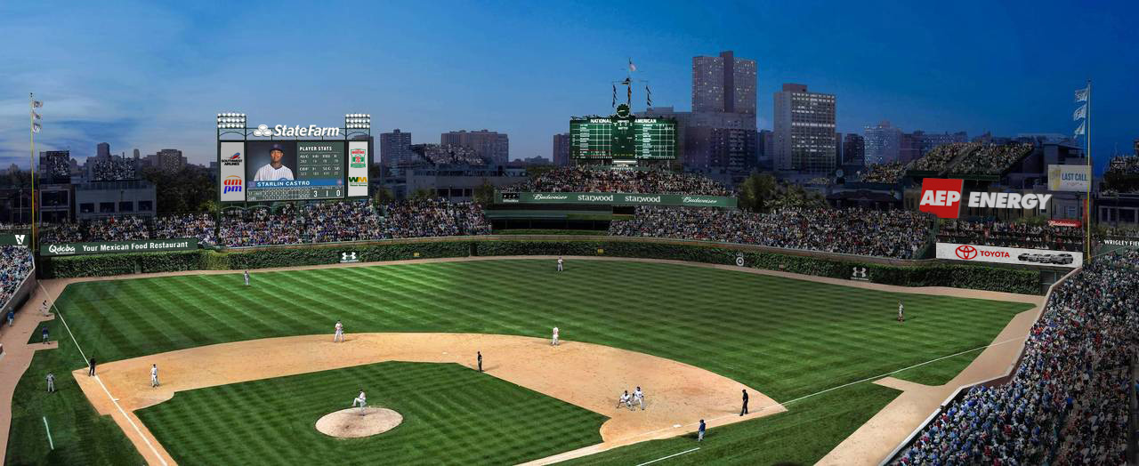 Image credit: Erik Maldre
The renderings released by the Cubs showing how Wrigley Field would look like after its proposed "historic restoration" was overshadowed by team chairman Tom Ricketts's half-assed threat to move the team if they don't get the Jumbotron in left field. (The only ones who seem to be taking Rickett's statement seriously are Rosemont and other suburbs if Ricketts is serious.)
Artist/designer Erik Maldre took a look at the renderings and the captions that accompanied them in the Tribune, then photoshopped what all the new signage would look like with advertising and sponsorship tacked onto them. The Cubs' rendering showed signage, but Maldre writes the image above "gives a more realistic idea of how those advertised surfaces may look."
We decided to compare Maldre's amended rendering with how Boston's Fenway Park looks today, since Mayor Rahm Emanuel has referred to relaxing Wrigley Field's landmark status a "Fenway plan." You can see from the comparison Maldre's onto something.
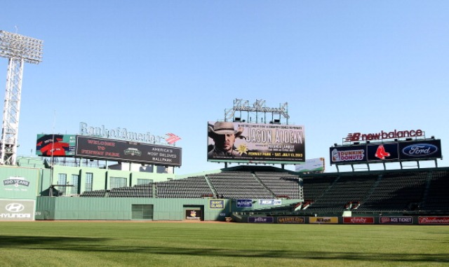
Photo credit: Marc Andrew Deley/Getty Images
The revenue the Cubs stand to earn from advertising and new signage inside Wrigley Field has been untapped for decades, thanks to the landmark status on the park and shotsighted deals like the 20-year contract current Cubs President of Business Operations Crane Kenney negotiated with the rooftop clubs in 2004. So it's easy to see why Ricketts views the Jumbotron as non-negotiable. It's possibly the linchpin in the renovation plan.