Watch Chicago's Middle Class Simply Vanish Over A Forty-Year Period
By Jon Graef in News on Apr 5, 2014 6:45PM

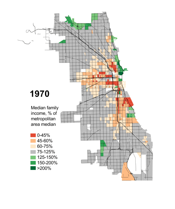
Over at his personal blog, University of Chicago Masters student Daniel Hertz shows, using data from education scholar Sean Reardon and sociologist Kendra Bischoff, as well as his own research from 2012, how Chicago's middle class simply vanished over a period of more than forty years, from 1970 to 2012.
In short: the rich got richer, and the poor got much, much poorer.
Hertz highlighted Chicago's increase in income equality and income segregation, which is a microcosm of the wealth gap facing the United States as a whole, using maps. The maps, needless to say, are a striking visual document.
The maps, which Hertz published on his City Notes blog, were picked up by Lisa Wade, Ph.D, over at Sociological Images. Here's how she explains them:
Borrowing data from education scholar Sean Reardon and sociologist Kendra Bischoff, Daniel Hertz calculated where the median family income of each Census tract fell relative to the entire metropolitan area. Orange tracts are ones where the median family income is 0-45% of the median for Chicago as a whole (struggling families), dark green tracts are ones where the median is 200% or more (resource rich families). Grey is, literally, middle class.
Wade then compares and contrasts the middle class in 1970 versus 2012. Needless to say, the lack of grey [middle class] is stark and astounding. [Though, sadly, not surprising.]
About the maps, Hertz himself says:
Inequality has always been a part of Chicago - as it has always been a part of the United States, and a part of humanity - but the forms it has taken, and the severity of those many forms, have changed in truly dramatic ways. Take, for example, today’s monolithic segregation of African Americans: at the turn of the last century, black Chicagoans were less segregated than Italians, and not because Italians were then hyper-segregated.Moreover, decisions made by people in the city have played, and continue to play, a huge role in determining what those changes look like. ... This isn’t to say that national and global factors aren’t important, since they obviously are. But neither do we lack responsibility.
...
[T]he obvious and immediate reaction to these maps is to see them as a direct consequence of rising income inequality. There is some truth to that, but the researchers from which much of this data came have already discovered that income segregation has actually risen faster than inequality
Check out an animation of all Hertz's maps, which includes years 1970, 1980, 1990, 2000, 2007, and 2012, here.