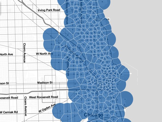
Somebody Made An Online Heatmap Of Every Divvy Trip Taken in 2013
By Jon Graef in News on Jul 27, 2014 8:00PM
Ever wondered where people often go when they get on those Divvy bikes? A Chicago data scientist did. So, using data from when Divvy bikeshare users check out and return their bikes to their docks, Gabriel Gaster created a map of all 750,000 Divvy trips taken in 2013. More precisely, the map's website characterizes the data as a "heatmap of aggregate bike trips throughout the city from a selected station...". Each region highlighted by the map represents an area approximately half a mile away from the mapped Divvy stations.
Chicago Magazine's Whet Moser spoke to Gaster, who reportedly works at Datascope Analytics, about the map and what neighborhood traffic patterns it finds. (About the map, Moser concludes the following: "It’s a reminder that modes of transportation do more than take us from Point A to Point B—they shape cities, visibly and invisibly, guiding other modes of transit in their paths.")
