Interactive Map Shows Which Presidential Candidates Chicago Backs By Zip Code
By Mae Rice in News on Mar 14, 2016 8:20PM
Who are your neighbors voting for? Do any of them secretly support Donald Trump? There's no way to know for sure, but real estate startup RentHop has crunched the Federal Election Commission's campaign finance numbers to at least break down which candidates Chicagoans have donated to by zip code.
Key takeaways from the interactive map below include:
* Overall, Chicago is a wildly blue city. There's not a zip code in the city limits where the majority of donors gave to Republicans.
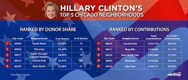
* Chicagoans disproportionately support Hillary. Cook County donated $3 million to her campaign, more than we gave to all the other presidential candidates combined.
* South Shore and Lincoln Park support Hillary most strongly. South Shore had the highest proportion of donors (65 percent) that gave to Hillary; Lincoln Park gave her the highest proportion of its donations (69 percent).
* Bernie Sanders dominates Rogers Park. A whopping 74 percent of the donors there gave to his campaign.
* Our most generous zip code is the Mag Mile area. 60611, home to Water Tower and most other Mag Mile landmarks, donated $651,175.11 to presidential candidates—more than half of that to Hillary.
* Cook County supports Marco Rubio more than any other Republican. We gave him $549,690—which is still less than the $604,335 we gave Bernie.
* Basically everyone in Chicagoland hates Donald Trump. Out of roughly 6,000 political donors in Cook County, only 40 gave to Trump, and they only gave him a paltry $18,172.
* Even in the zip codes where Trump is most popular, he's not popular at all. In Lemont, the zip code where the highest percentage of donors gave to his campaign, only two people gave Trump money.
The RentHop map, embedded below, lets you browse for more granular neighborhood data. Check it out:
