Map Shows Reasonable Chicago Rent & Decent Commute Are An Impossible Combination
By Sarah Gouda in News on Sep 16, 2016 5:16PM

(istockphoto)
If you have subjected yourself to the cruel and unusual punishment that is looking for a 1-bedroom apartment in Chicago in the year of our lord 2016, you've likely had to claw yourself from the grips of madness at multiple points through the process. Becoming a ghost and haunting an unfilled unit often seems more viable than mortally obtaining affordable housing. Well, now there's more confirmation that your increasingly spooky thoughts are warranted: Renthop has just built a map of median rents for one-bedroom apartments across the rail lines in Chicago. Bottom line, it's depressing.
The map provides detailed analysis for each train line, so you can see how much median rents have changed in the areas relevant to you. Unsurprisingly, the most sure-fire method for saving cash is to move at least 2-3 miles outside of the loop in any direction.
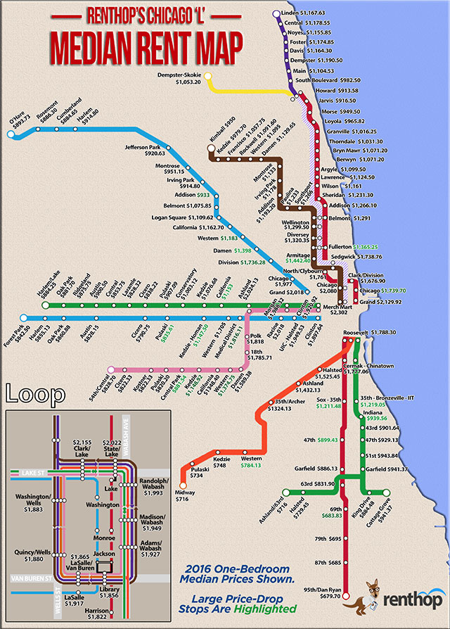
Though Renthop made the map to illustrate rents geographically throughout Chicago, it also notes what it calls "affluence cut-off areas." For example, median monthly rent between the Grand and Chicago Red Line stops drops by $390, which could lead to $4680 saved a year for moving just one stop out.
Other interesting findings? The Damen Blue Line stop is 5% cheaper than Division; the Chicago Red Line stop is $340 cheaper than the nearby Chicago Brown/Purple Line stop; and the highest median rent overall was at the Merchandise Mart Brown/Purple Line stop, clocking in at $2302 per month.