"OWN" Meets "UGH:" Oprah Reveals Network Logo With Colors Insulting To Nature
By Chuck Sudo in Arts & Entertainment on Oct 29, 2010 2:20PM
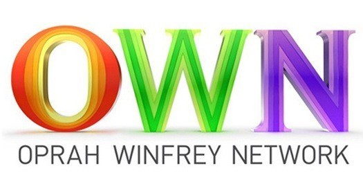
Oprah Winfrey unveiled the logo for her Oprah Winfrey Network yesterday and it looks like other media aren't happy with the color scheme, which uses colors largely ignored in the Crayola big box.
New York Magazine's "Vulture" entertainment blog ridiculed the logos "use of serifs" and likened the color scheme to "a stately fluorescent look that would totally be on the currency of a country started by a gaggle of 9-year-old girls at a slumber party." Fitting, now that we remember the countless images of women in the "Oprah" show audience freaking out at giveaways. Our own Tony Peregrin was more succinct, saying "it is butt-ugly."
So it's ugly. Isn't anyone afraid that the initials of Oprah's network spell "own?"