These Maps Show Just How Dense Chicago Neighborhoods Really Are
By Gwendolyn Purdom in News on Jul 6, 2016 8:03PM
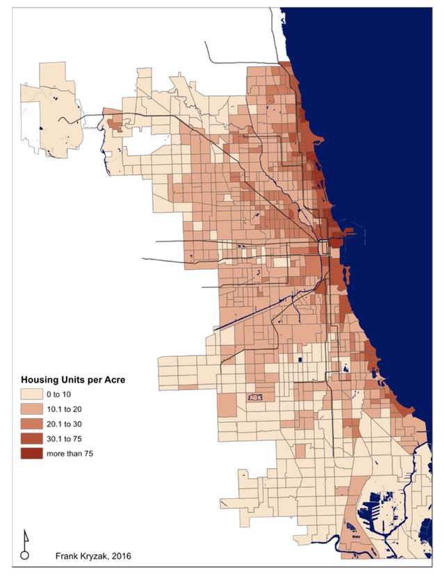
Image courtesy of Frank Kryzak
Despite what your squished commute on the L might suggest, there's a lot more to the story of Chicago's density than just how many people are crammed together on an acre. Urban-minded writer Frank Kryzak knows that better than anyone after he recently compiled Census data to create a series of eye-opening maps that illustrate just how dense different Chicago neighborhoods actually are.
Instead of the standard method of examining the city's density by the number of people per acre, Kryzak mapped out the number of residential units per acre and that shift created a unique perspective of the city's layout. This can transform the way you see a neighborhood: a neighborhood with a bunch of tightly-packed single family homes will look different than a neighborhood full of apartments with just one or two residents.
Kryzak found that most of the city is not super dense. Most of its densest areas line the North Side (things got especially cramped in, you guessed it, neighborhoods like Wicker Park, River West, Logan Square, Bucktown and Avondale); neighborhoods that follow the Pink Line like Little Village; and select areas along the south shoreline. His findings lined up with what most people tend to assume about the city: the North Side and select other pockets are where things are most dense.
But Kryzak points out that even neighborhoods that are similarly dense, by the numbers, can feel starkly different in terms of lifestyle and feel, depending on how the neighborhood is set up.
Take, for example, a census tract Kryzak studied in the South Loop has a very similar population density (around 16,000 per square mile) to a tract near the West Belmont neighborhood but if you take a look at the Google Earth view of each area, the hulking condo towers of the South Loop look nothing like the neat nearly suburban plots of Belmont, because the number of residential units per mile isn't even close (48.3 for the South Loop versus West Belmont's 9.5).
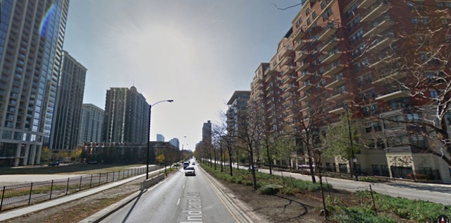
A census tract in the South Loop (Google Maps)
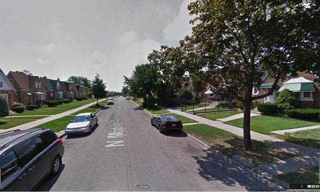
A census tract in West Belmont (Google Maps)
Density can be something of a hot-button issue when it comes to city resources, development and planning. Kryzak's work is a handy reminder that there is always more than one way to look at an issue. You can check out Kryzak's full post here.